The art of selecting colors to adorn the different rooms in your home is a powerful tool for shaping the ambiance and mood of each space. It’s a choice that can elevate a room from ordinary to extraordinary, turning chaos into tranquility. Join us as we explore a palette of color recommendations, finely tuned to suit the unique needs of each area within your home.
Whether it’s a living room designed for relaxation, a kitchen dedicated to culinary creativity, or a bedroom that beckons serenity, we’ll guide you through the transformative potential of color in every corner of your living space.
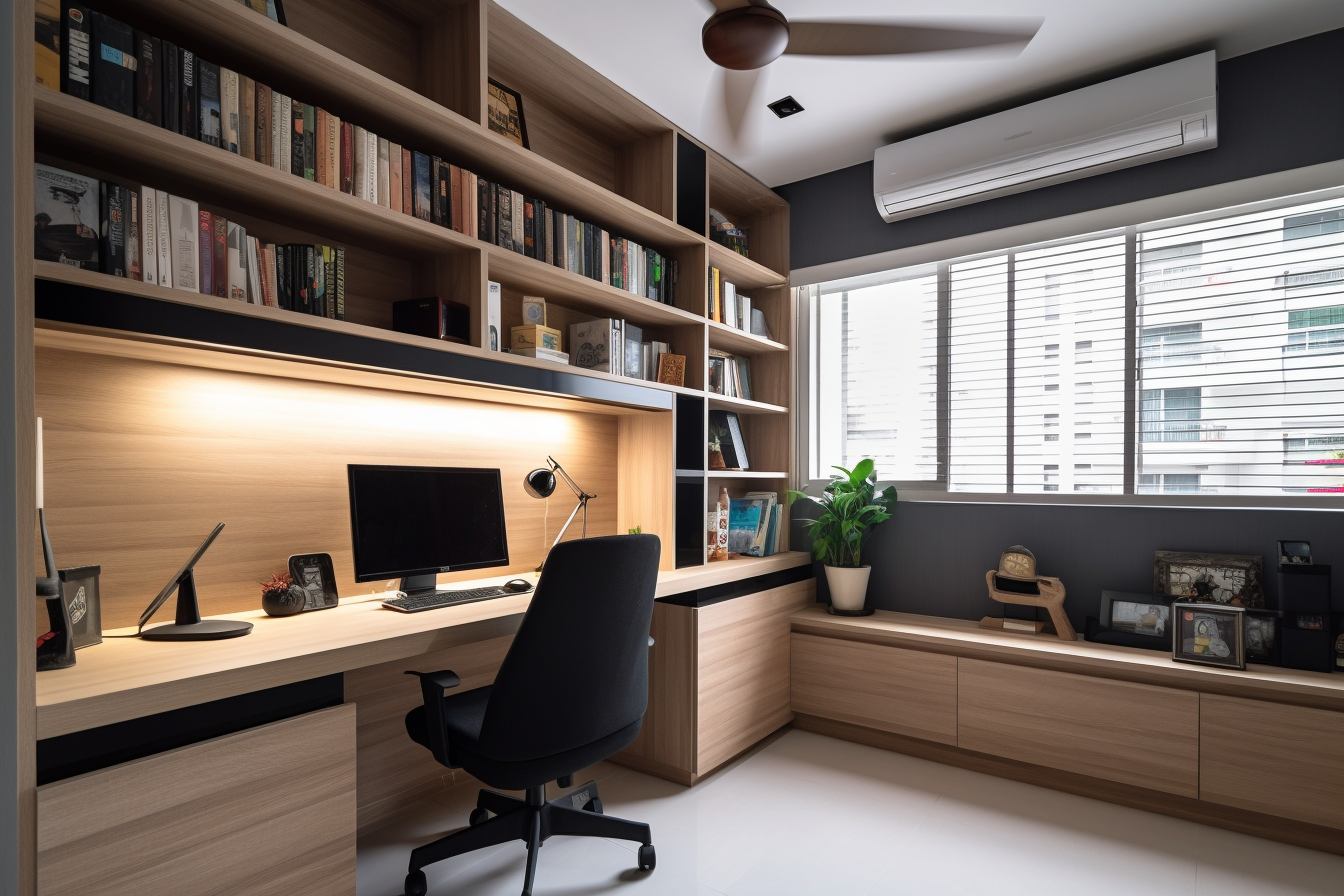 Colors for Study / Home Office
The study / home office is a place where people focus on work or study, so it is important to choose colors that promote concentration and productivity. Some good colors for a study include blue, green, and gray. These colors are calming and relaxing, which can help to improve focus and productivity.
- Cool Neutrals: Consider using cool neutral colors like light gray, soft blue, or pale green in a study. These colors can create a calming and focused atmosphere, which is ideal for productivity.
- Accent Colors: You can add energy and creativity by incorporating accent colors like deep red, navy, or mustard yellow in the form of furniture, artwork, or accessories
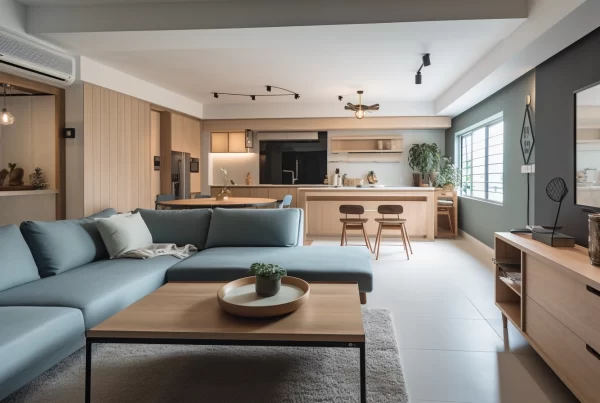
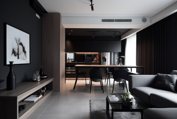
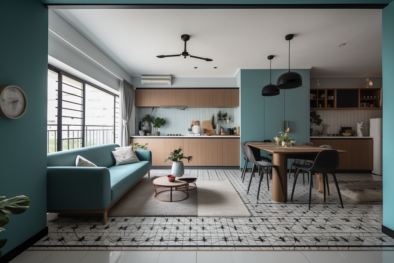 Colors for Living Room
When it comes to selecting colors for the living room, the choice should prioritize creating an inviting and comfortable atmosphere, as this space is where people come together to relax and socialize. Warm colors like yellow, orange, and red are excellent options for this purpose. These hues have the ability to infuse the living room with a sense of coziness and warmth, making it a welcoming haven for both relaxation and social gatherings.
- Warm Neutrals: Warm neutral tones like beige, taupe, or light brown create a cozy and inviting feel in the living room. They are versatile and work well with various decorating styles.
- Earth Tones: Consider earthy colors like terracotta, olive green, or warm shades of blue for a natural and relaxed ambiance.
- Accents: Add pops of color through throw pillows, rugs, and artwork to inject personality and vibrancy into the space.
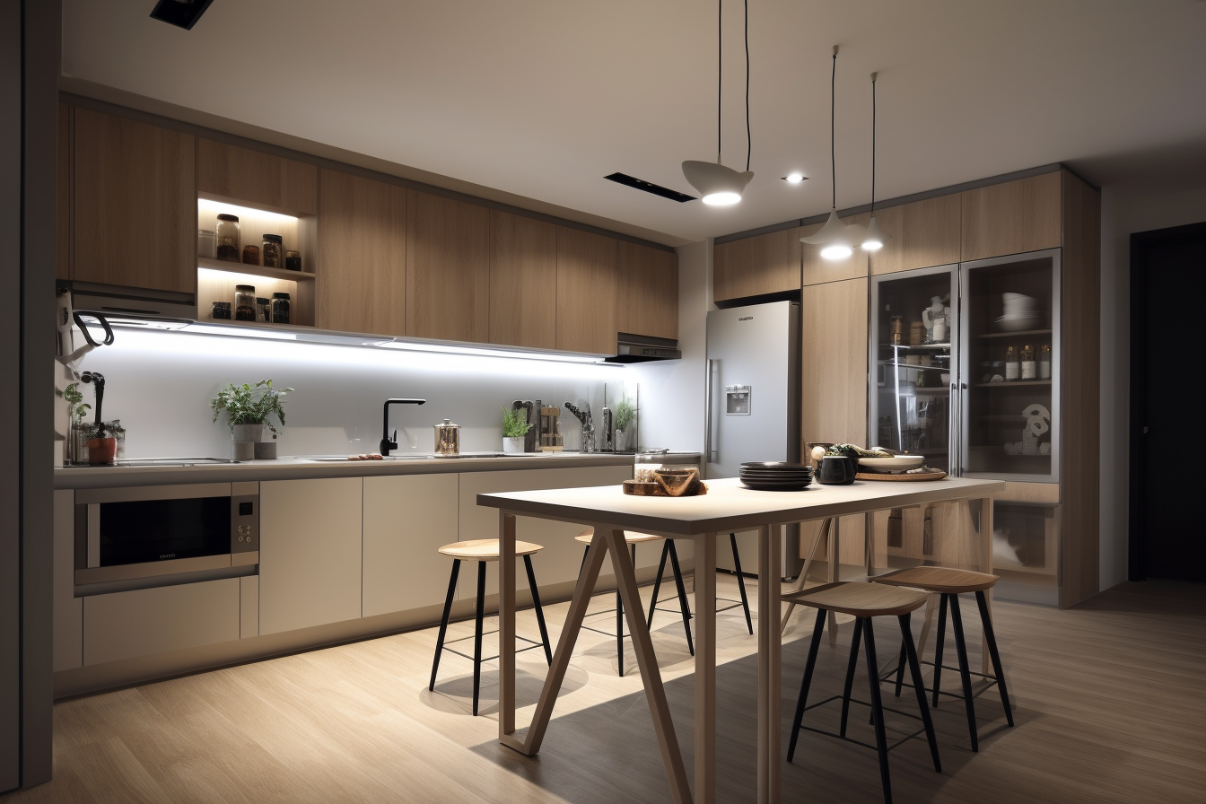
Colors for the Kitchen
When it comes to selecting colors for the kitchen, it’s essential to focus on creating a clean and refreshing ambiance, given its role as the hub for food preparation and cooking. Opting for colors like white, light blue, and light green is a smart choice. These shades have the power to infuse the kitchen with a sense of brightness and airiness. They not only make the space feel clean but also contribute to a visually appealing and invigorating environment, enhancing the overall culinary experience.
- White: White is a popular choice for kitchens as it creates a clean and bright environment. It also makes the space appear larger.
- Soft Blues or Greens: Soft shades of blue or green can be used for cabinets or accents to add a refreshing and calming touch.
- Neutral Backsplash: Consider neutral tones like beige or gray for the backsplash to complement the white and add visual interest.
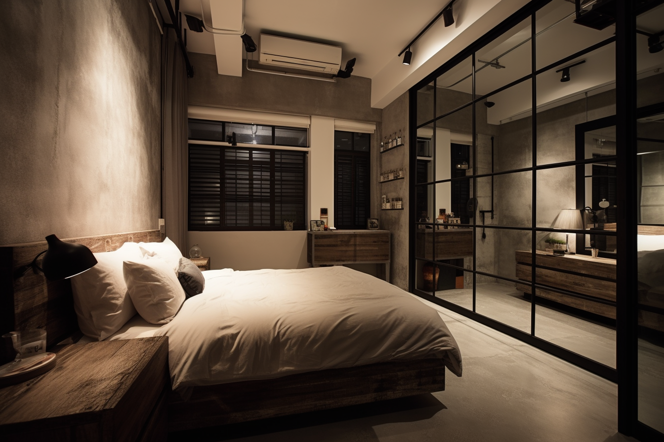
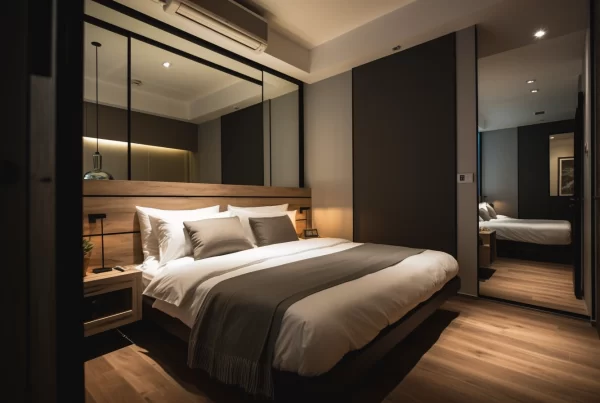
Colors for the Bedroom
When it comes to selecting colors for the bedroom, the key consideration is creating a calming and relaxing atmosphere, as this space serves as a sanctuary for sleep and relaxation. Opting for hues like blue, green, and lavender is a wise choice. These colors have a soothing quality that aids in promoting restful sleep and inducing a sense of tranquility. The bedroom, adorned in these shades, becomes a peaceful haven where one can unwind and rejuvenate, fostering a serene and restorative environment.
- Soothing Colors: Bedrooms should promote relaxation, so soft and soothing colors work best. Light shades of blue, lavender, or pale green are excellent choices.
- Earthly Hues: Earthy tones like warm grays, soft browns, or muted terracotta can create a cozy and restful atmosphere.
- Accent Wall: You can introduce a deeper or contrasting color on one wall behind the bed to create a focal point.
Other Points to Consider when Selecting Colors for your home
It is also important to consider the size of the room when choosing colors. Light colors will make a room look larger, while dark colors will make a room look smaller. If the room is small, it is best to choose light colors to make the room look more spacious.
Finally, it is important to consider the personal preferences of the people who will be using the room. Some people prefer bright and bold colors, while others prefer more muted colors. It is important to choose colors that the people who will be using the room will find appealing.
Here are some additional tips for choosing colors for your home in Singapore:
Consider the climate
Taking the local climate into account is crucial when selecting colors for your Singaporean home. Given the hot and humid weather, it’s wise to opt for colors that effectively reflect heat and light. Light hues are particularly well-suited for Singapore, as they play a pivotal role in maintaining a cooler interior environment. In this tropical setting, the right color choices can go a long way in ensuring your home remains a comfortable and refreshing oasis, shielding you from the sweltering outdoor conditions.
Consider the natural light
The amount of natural light a room receives is a critical factor in your color selection. When a room is flooded with abundant natural light, you have the flexibility to consider darker colors. These deeper shades can add depth and drama to the space, creating an atmosphere of coziness and elegance. However, in rooms with limited natural light, lighter colors are the way to go. Light hues work wonders by reflecting what little light there is, thereby brightening up the room and creating a more spacious and welcoming feel. Tailoring your color choices to the available natural light ensures each room in your home achieves its full aesthetic potential.
Consider the furniture and décor
The color palette of your furniture and decor plays a pivotal role in shaping the overall appearance of a room. It’s essential to choose colors that harmonize and complement one another. When your furniture and decor align with a coherent color scheme, they contribute to a sense of unity and balance in the room’s design. Whether you opt for a complementary color scheme that enhances contrast or a monochromatic one that fosters a soothing and harmonious environment, the colors of your furniture and decor should work in tandem to create a visually pleasing and cohesive space that reflects your personal style and taste.
Don’t be afraid to experiment
When it comes to choosing colors for your home, there are no rigid guidelines or strict rules to follow. In fact, it’s a canvas where you can freely express your creativity and personal preferences. Don’t be afraid to venture into the realm of experimentation. Mix and match different colors until you discover a combination that truly resonates with your style and creates the atmosphere you desire. Your home is a reflection of your individuality, and by embracing the freedom to experiment, you can craft a living space that’s uniquely yours, filled with colors that evoke the emotions and energy you seek in each room. So, let your imagination run wild and revel in the process of discovering the perfect color scheme for your home.
Remember that personal preference plays a significant role in color choices, so it’s essential to select colors that resonate with your style and preferences. Additionally, consider the amount of natural light in each room, as it can affect how colors appear. Always test paint samples in your space before making a final decision to see how they look under different lighting conditions.